HOGWARTS LIBRARY
Patient
- Scholastic
- Blair Project
Treatment
- Design
- Illustration
- Typography
Diagnosis
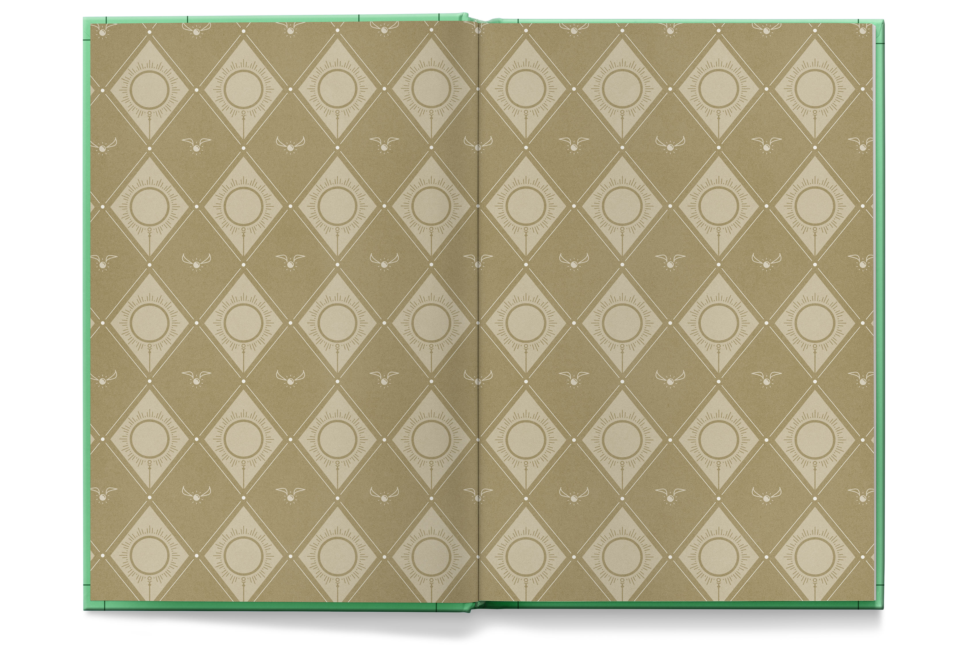
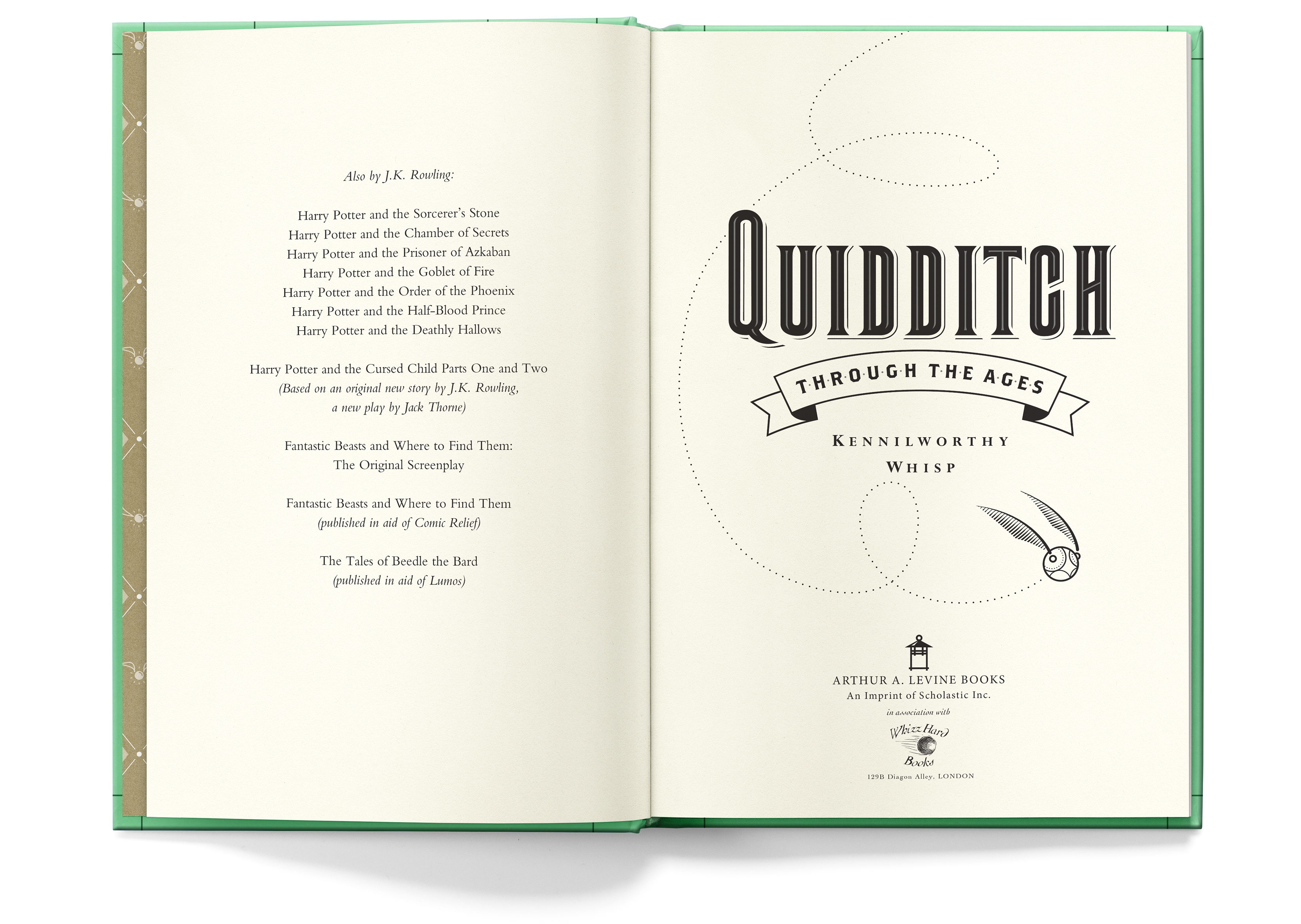
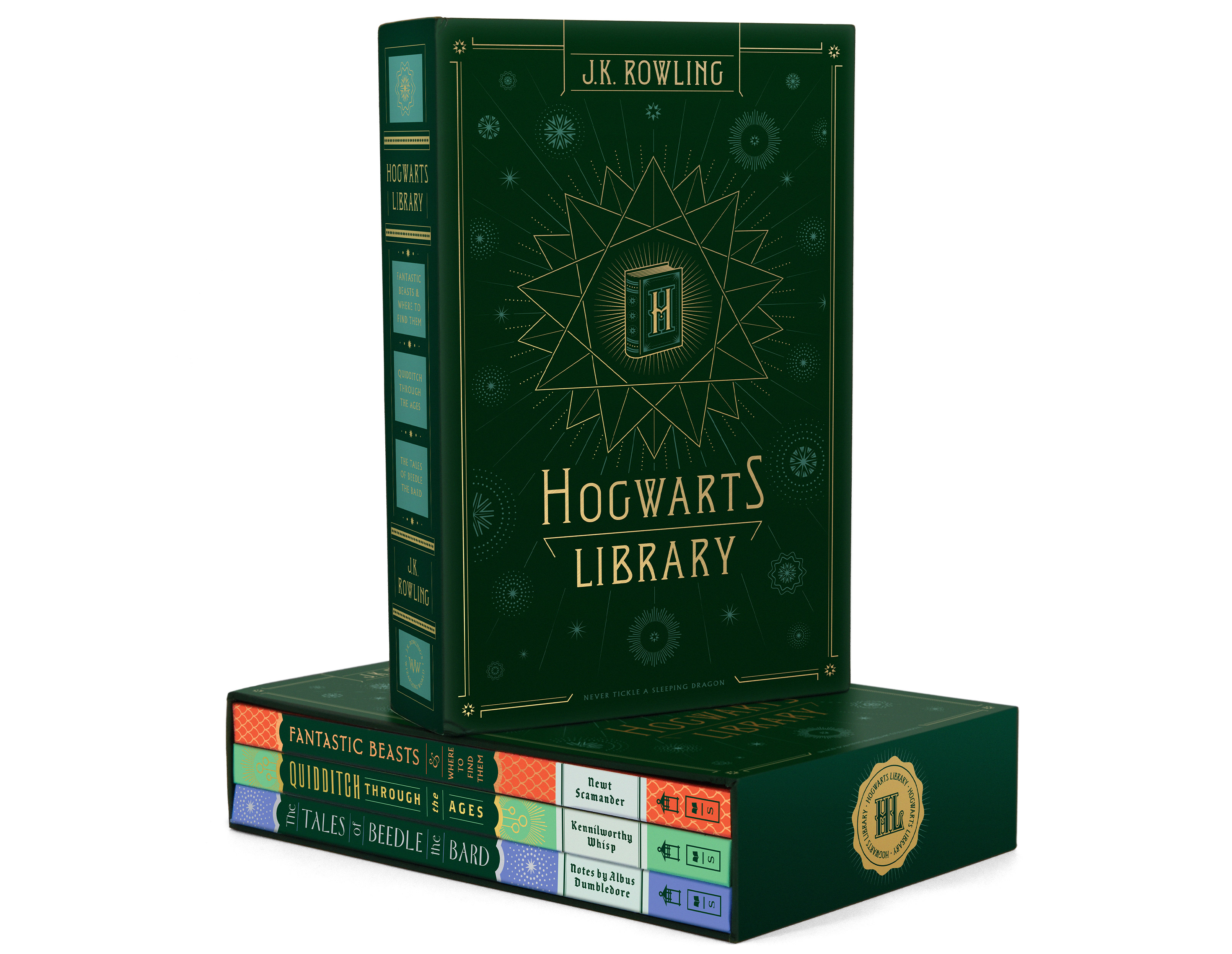
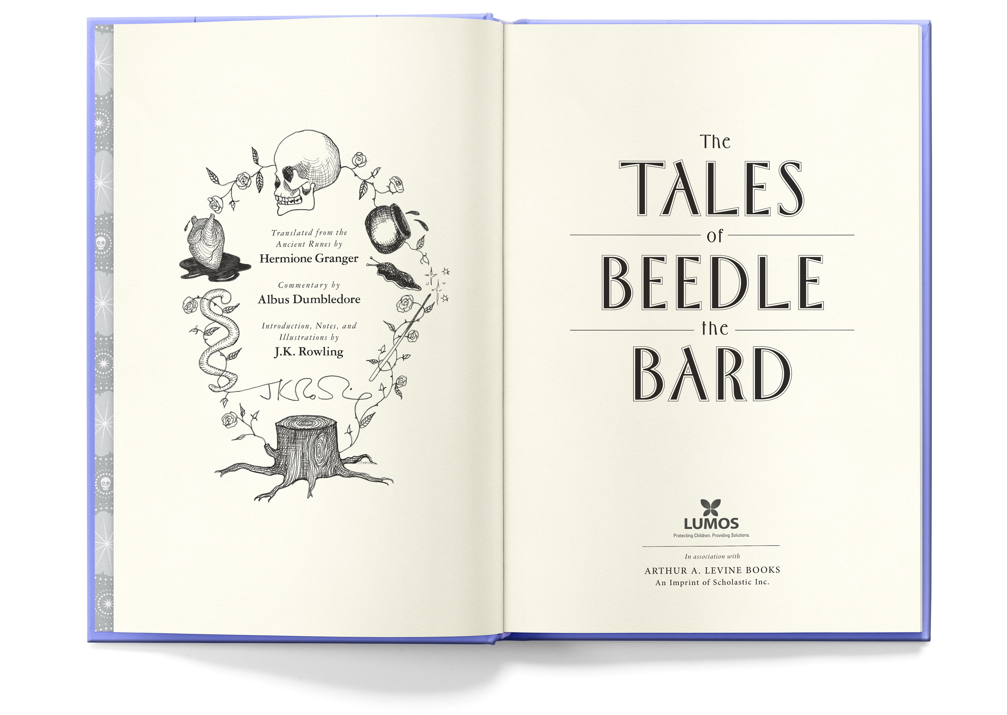
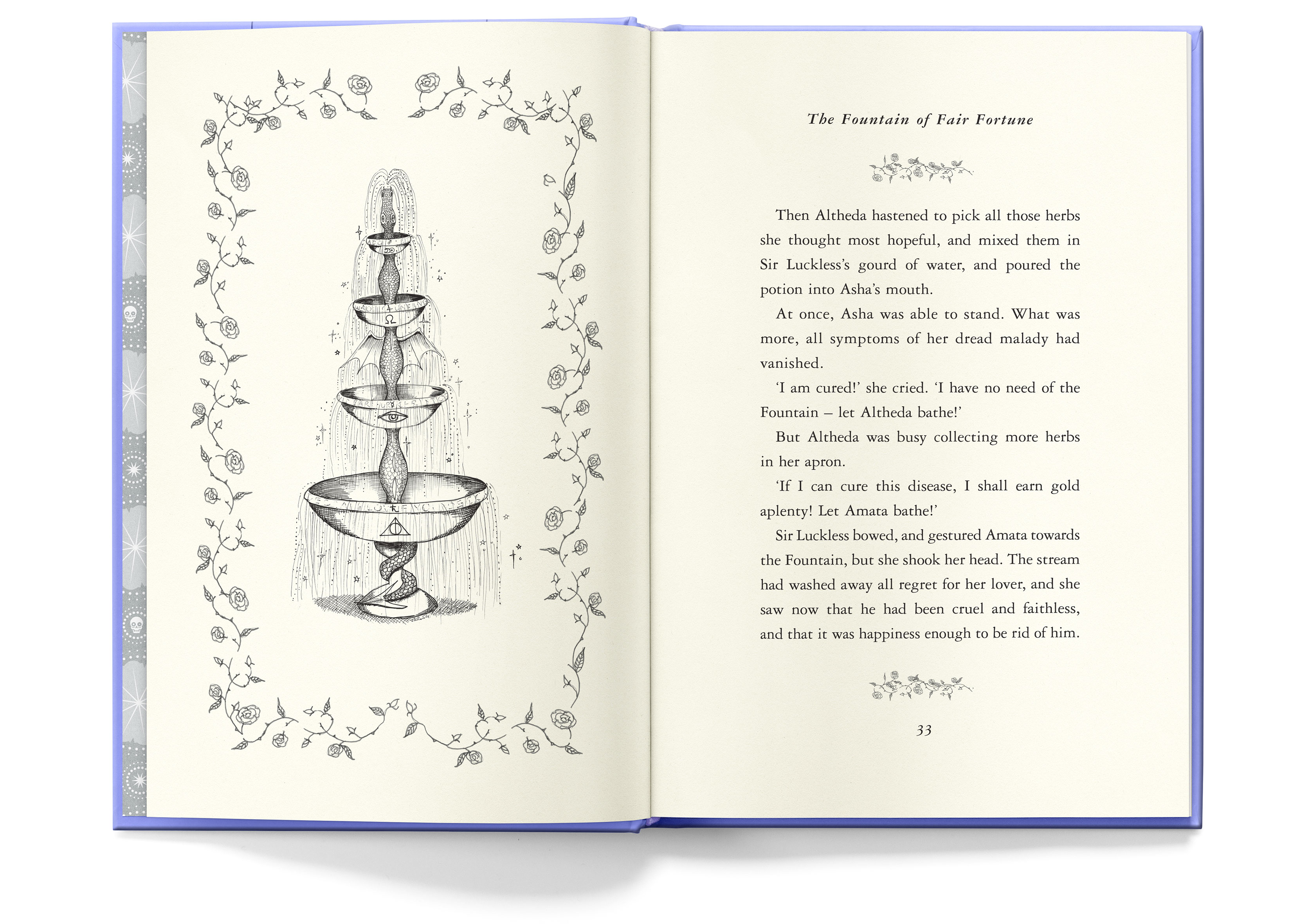
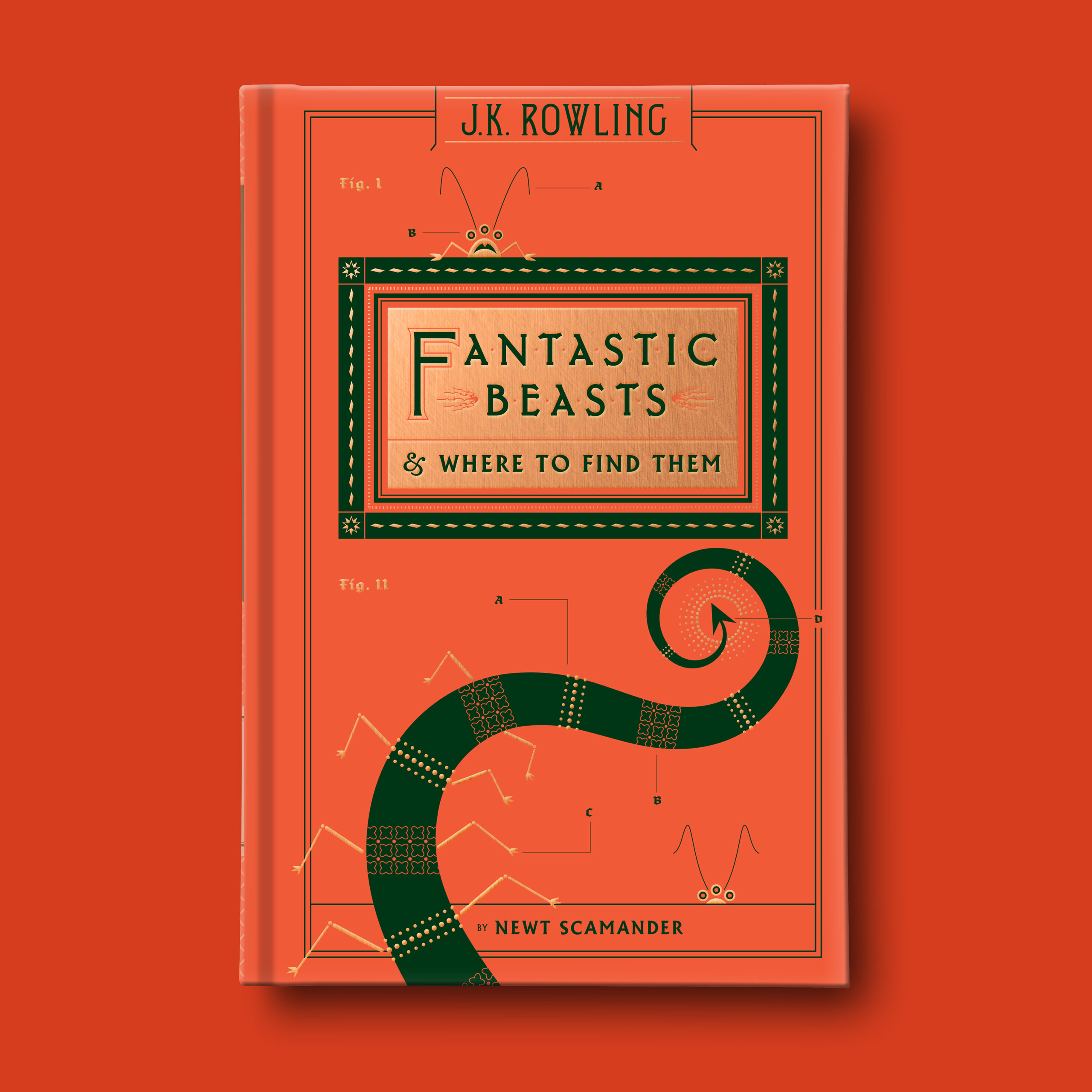
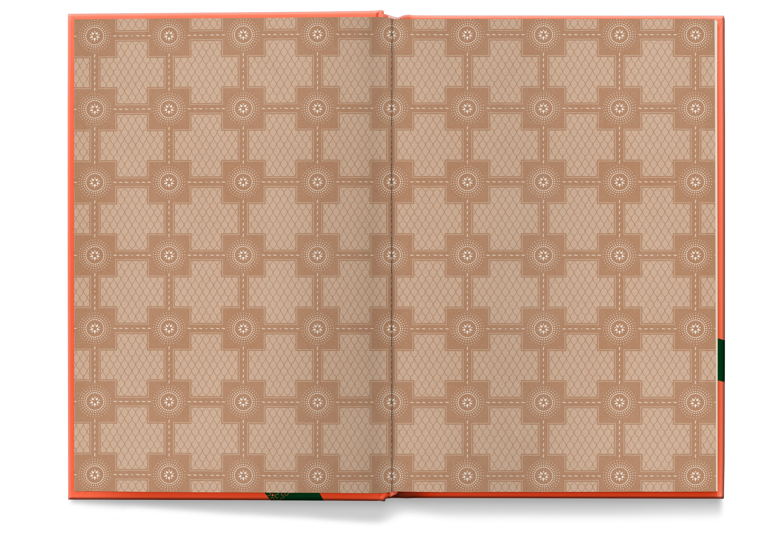
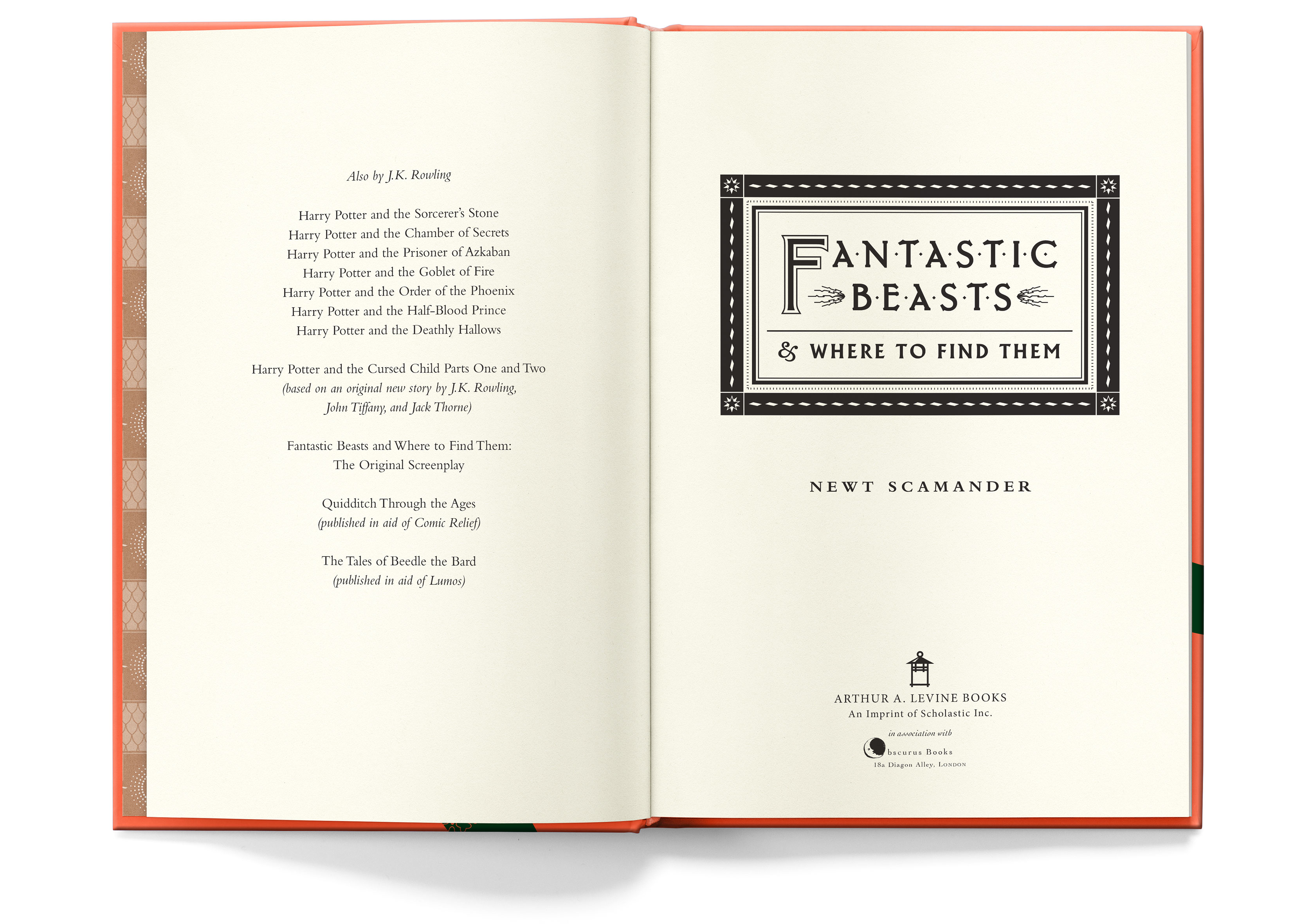
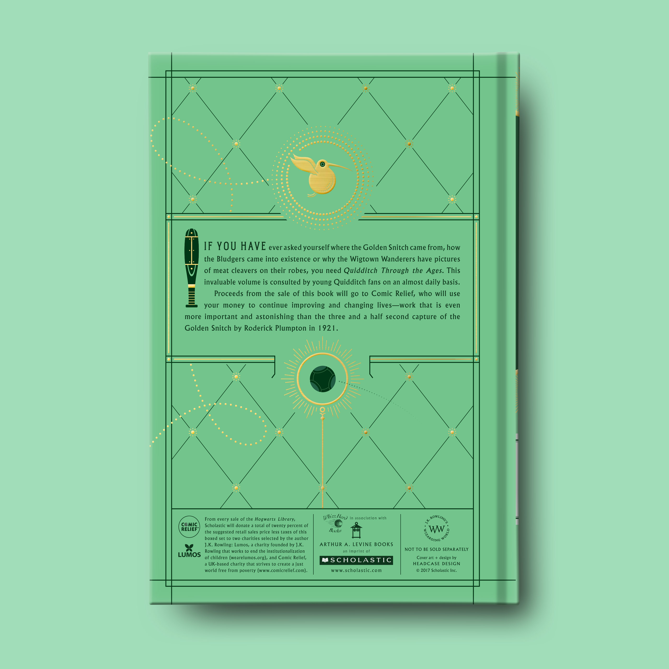
The Hogwarts Library collection gets periodically reprinted, with 20% of retail going to charity. Our approach to this reprint was to avoid the well-worn parchment look and give it a fresh and modern update with a punchy color palette, crisp and simple illustrations, and customized typography. Each book gets a unique endpaper design. The publisher didn’t want to reflow the book interiors and wanted to keep the existing interior illustrations, but we updated the title pages, borders, and header type to help unify the interiors with the new cover designs.
• 6 x 9 • foil stamped slipcase • 3 black and white hardcover books • each book features different cover foil and metallic endpaper colors (silver, copper, and gold)
The symbol for the Cloak of Invisibility, from the final tale in The Tales of Beedle the Bard, is duplicated and rotated to form an alchemical-style graphic evoking the essence of casting magical spells and is also subtly reminiscent of the hogwarts flower.
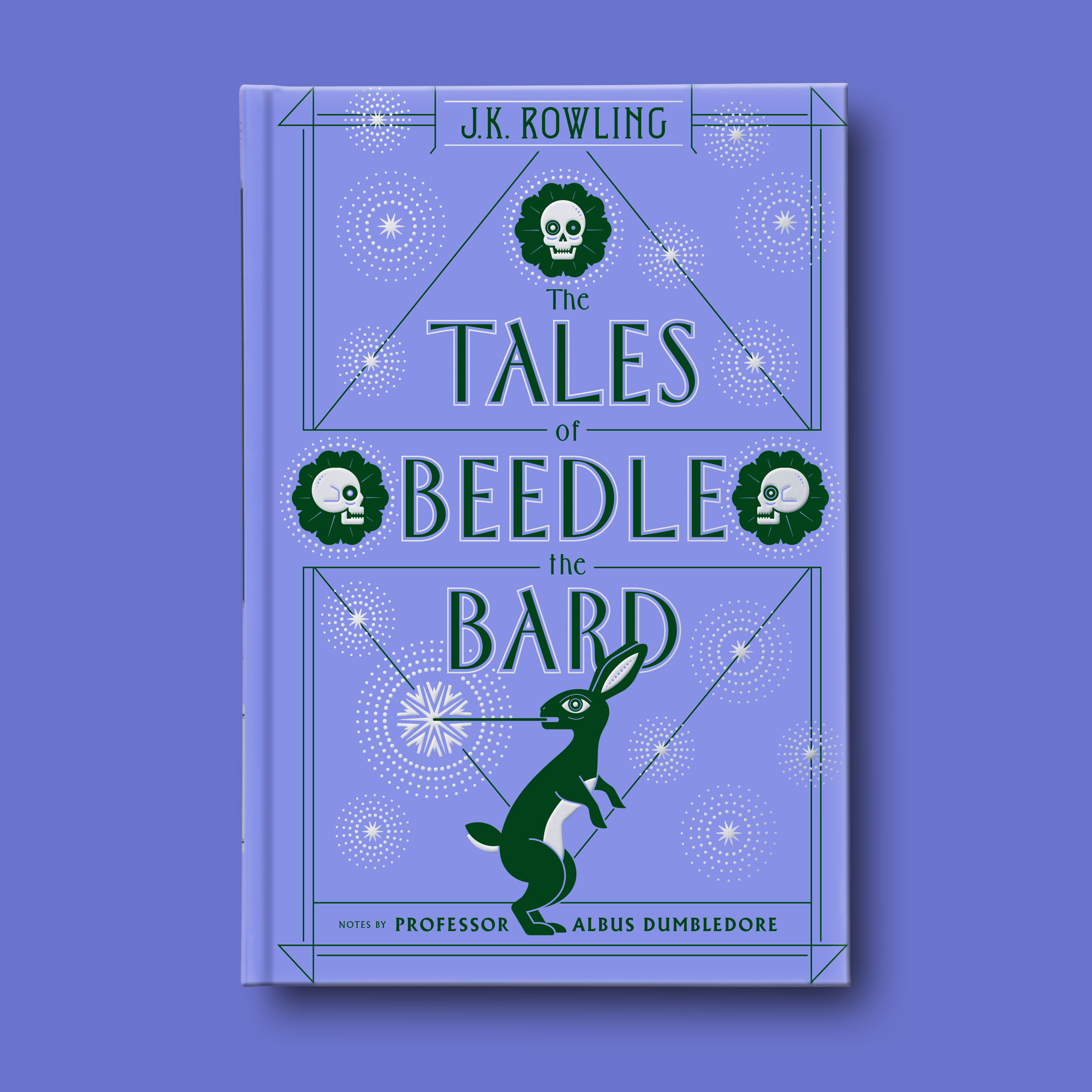

The flowers are built from gravestone shapes, inspired by the final story The Tale of the Three Brothers which details the brothers’ encounter with Death and their inevitable fate.
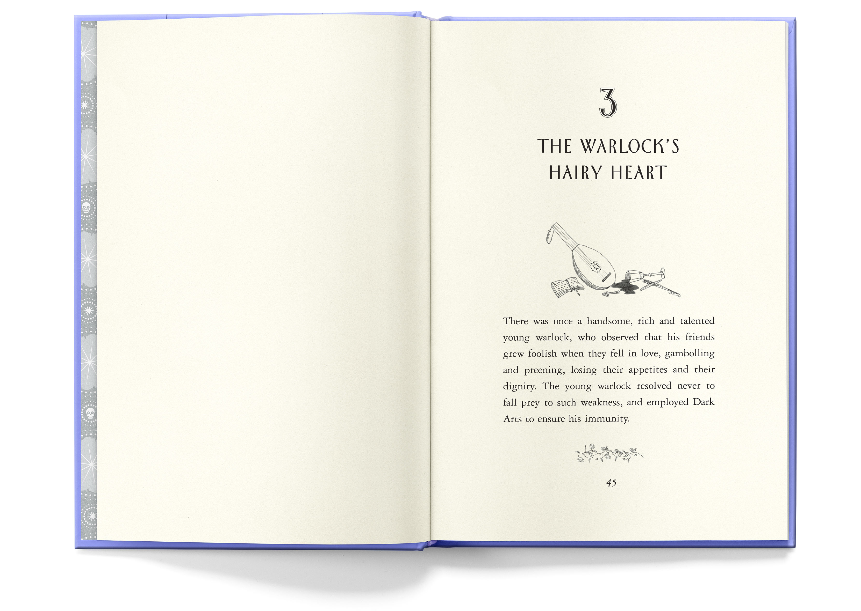
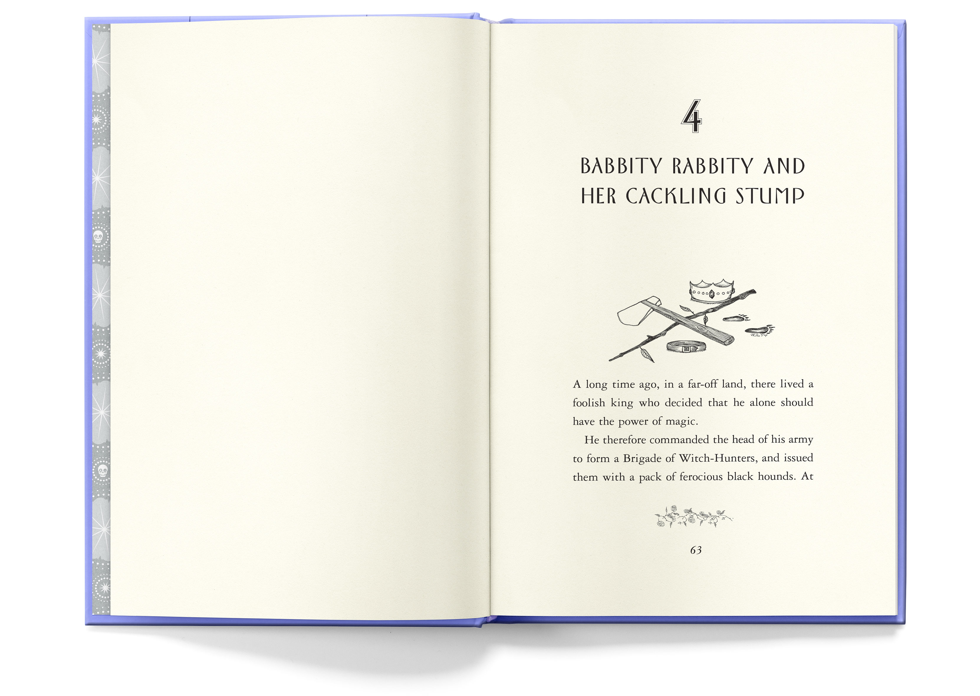
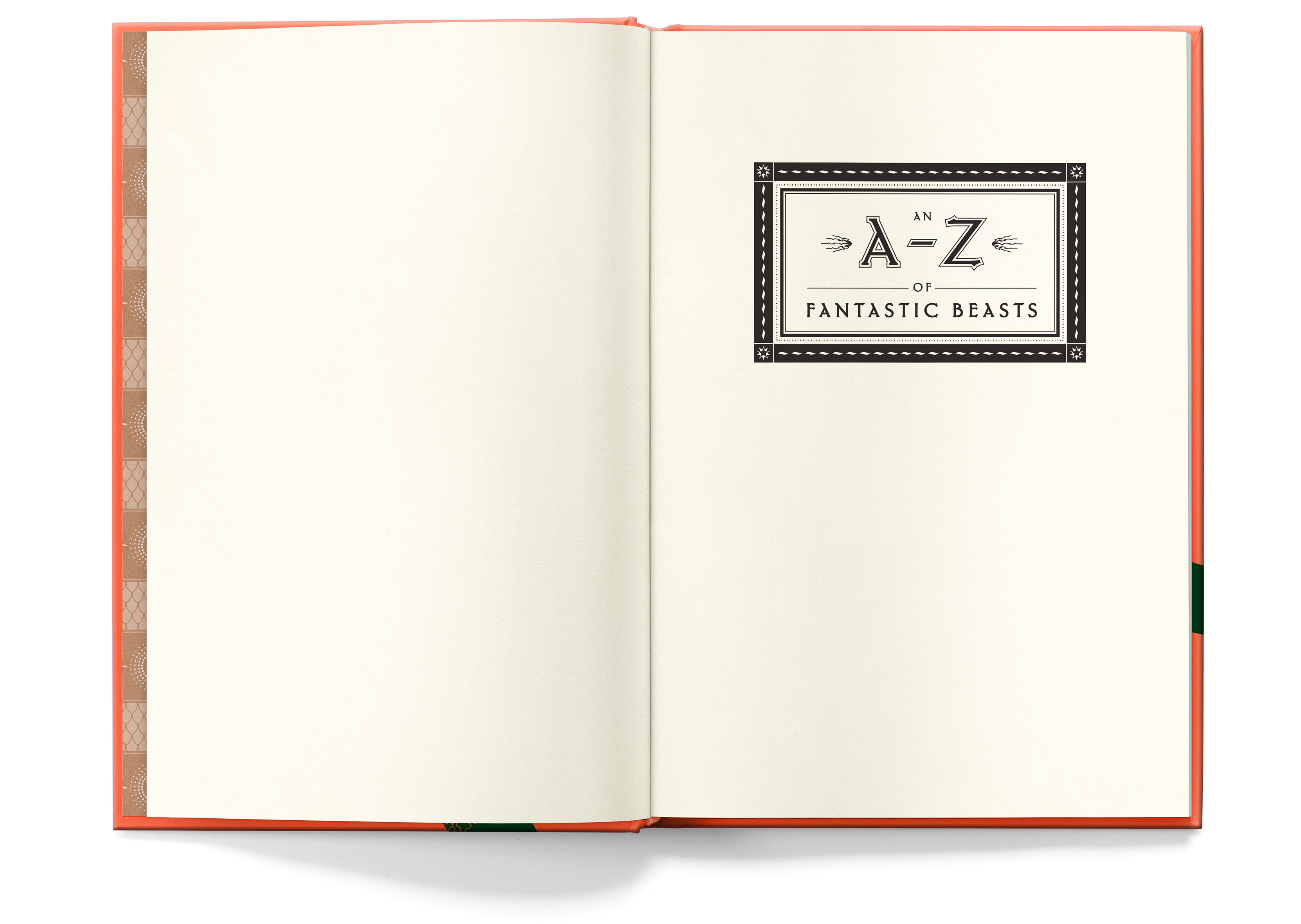
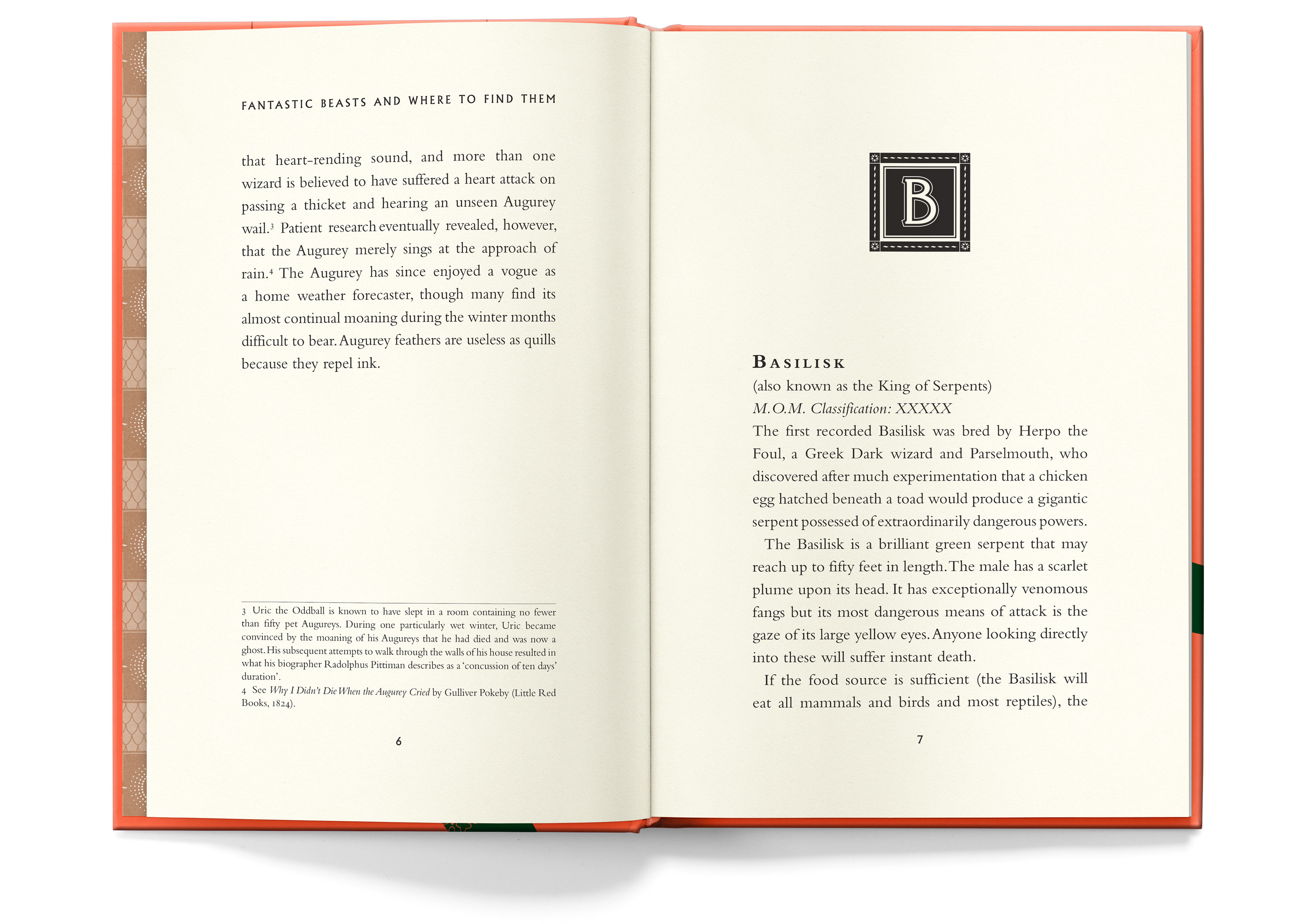
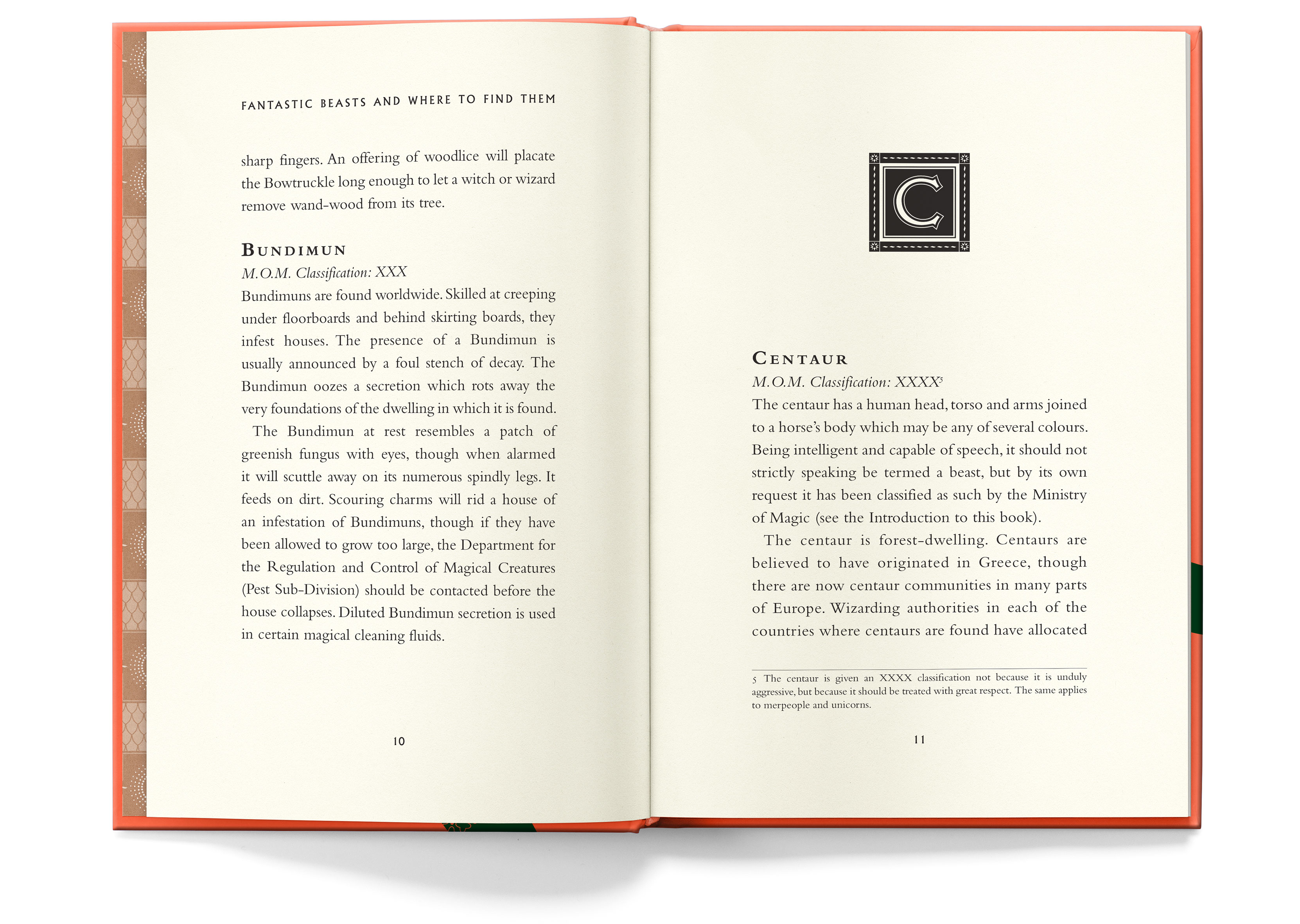
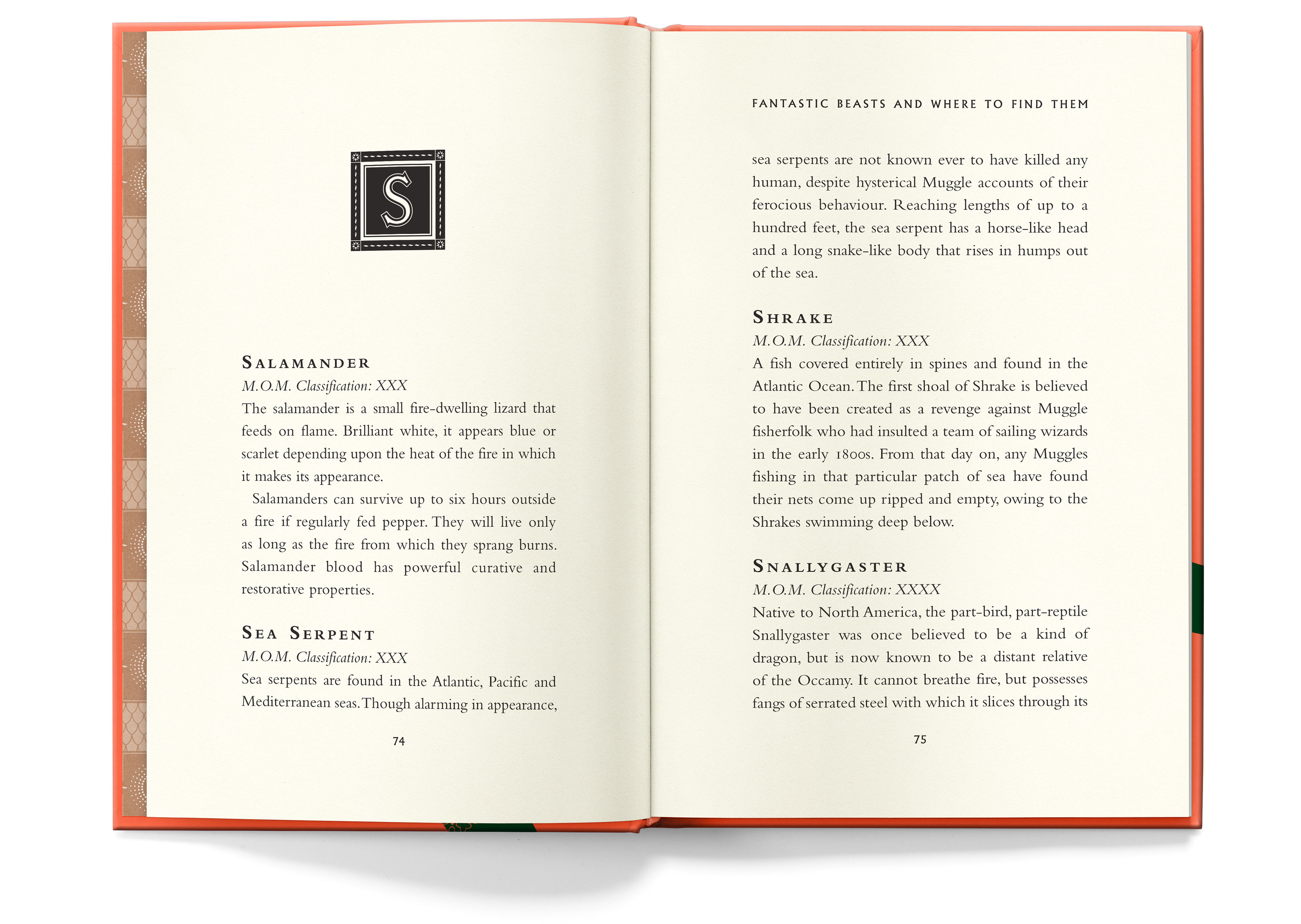
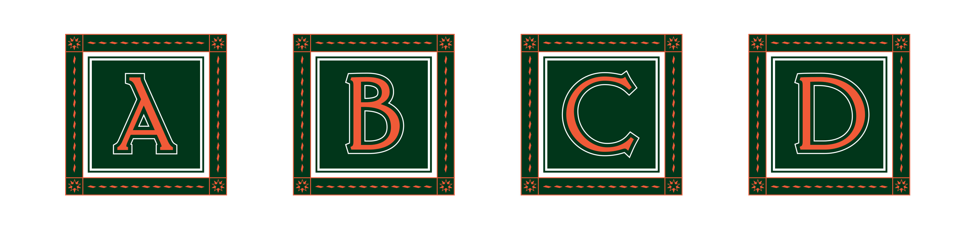
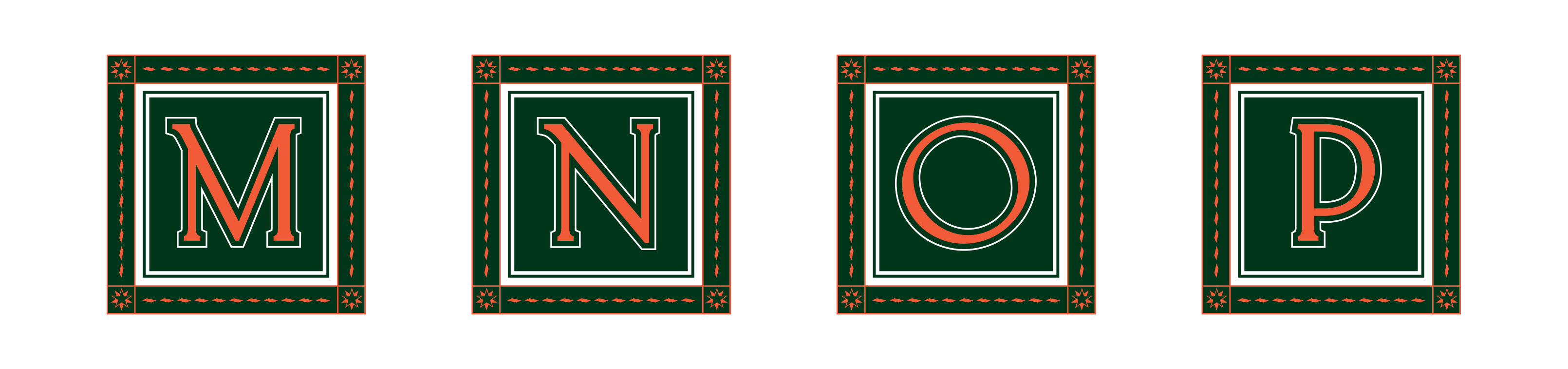
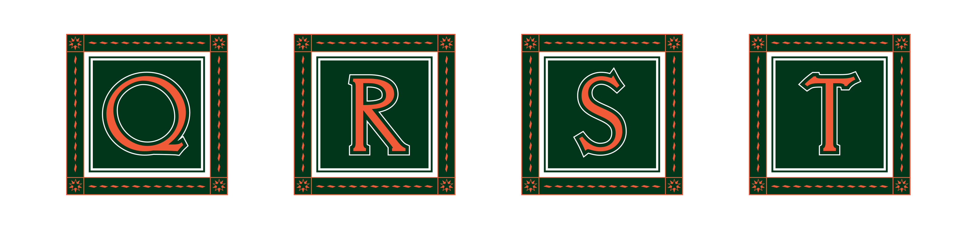
We created custom initial caps for each letter of the alphabet to be used as headers throughout the book.


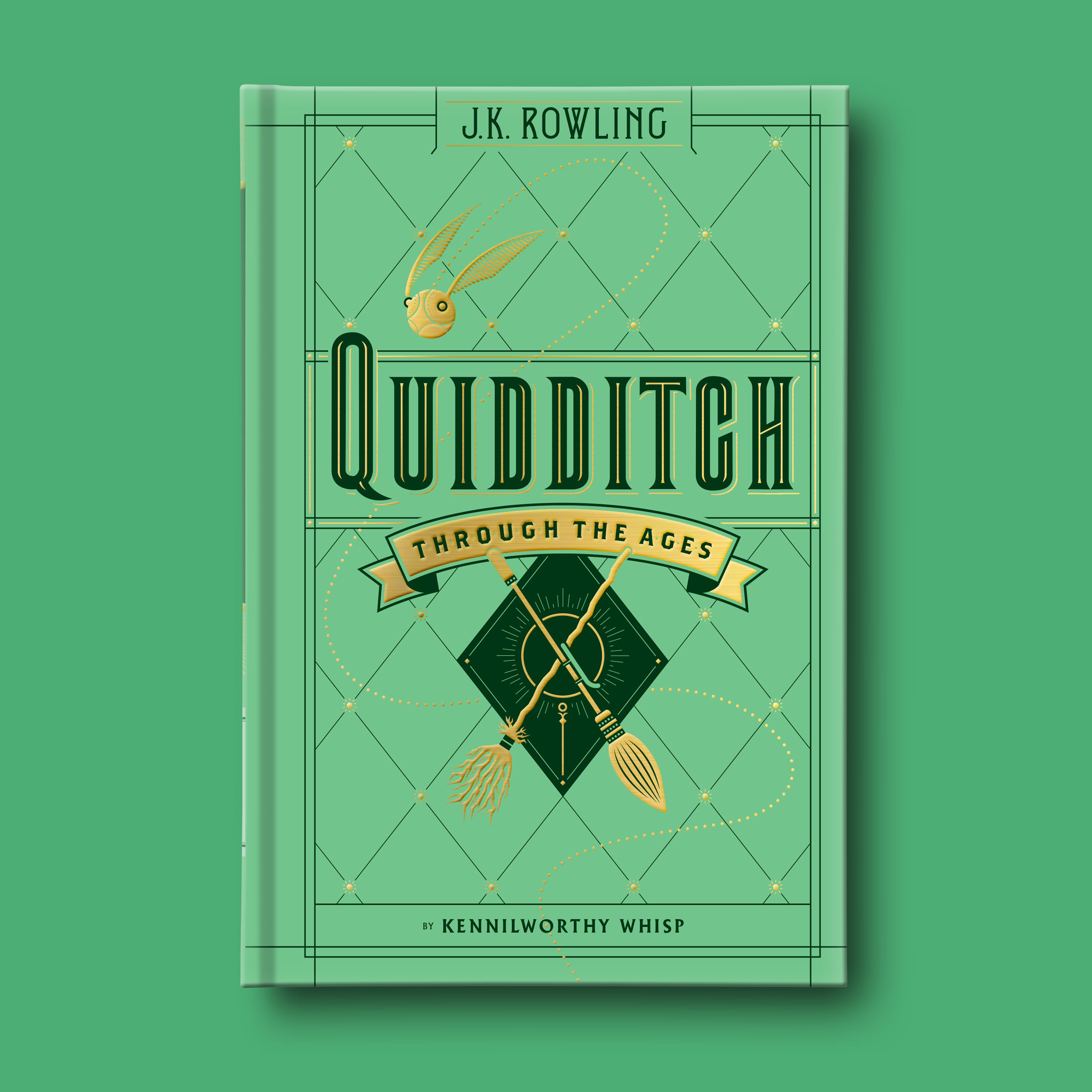
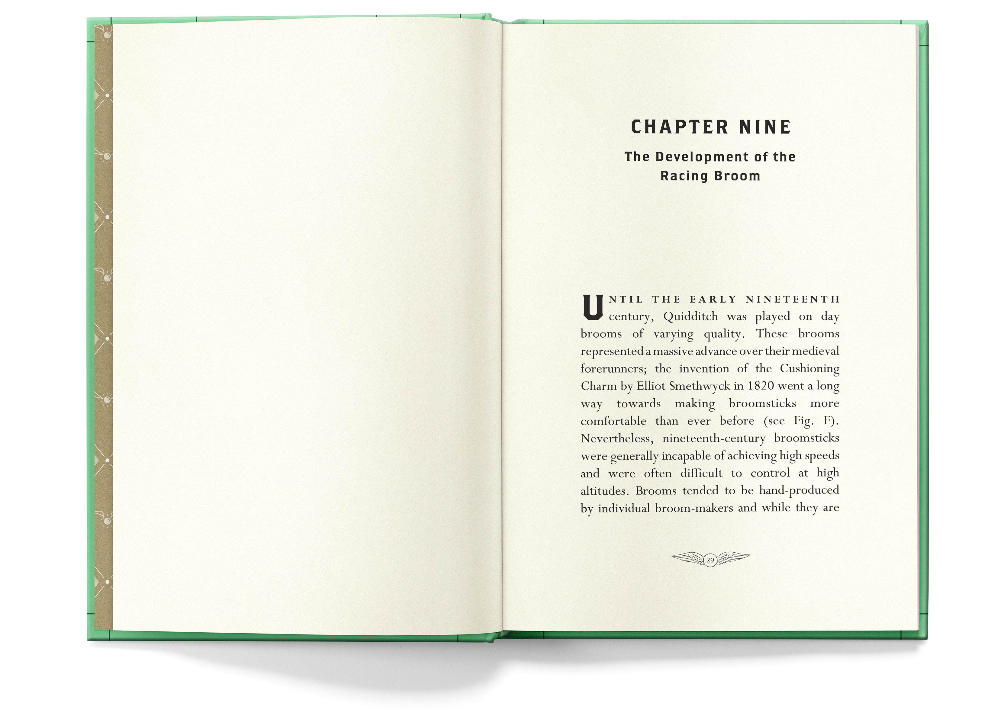
The two brooms represent how the Quidditch brooms have evolved over the last century.